Looking Forward to Look Back

The following lecture was presented by principal Jesse Reiser on April 19, 2021, at the University of Buenos Aires in Argentina. Drawing upon the firm’s work over the past 30 years, Jesse relates them to discipline-wide trends and recent developments in and around the field of architecture, including advances in structural engineering and renewed calls for social and environmental responsibility. The lecture will appear in Spanish as part of an upcoming book, Teorías Proyectivas, edited by Professor Santiago Miret and to be published in 2022.


Introduction
We've been practicing teachers, designers, and architects for over 30 years. Two years ago, we struggled to put together a book that, while not a summation of all of our work, would try to tackle the layered and difficult relationship between how we design, how we theorize, and how we practice. It was actually quite surprising for us because we thought at first that it could be fairly straightforward, but the entanglements one gets into in any type of architectural design suggested many possible and valid ways of structuring the book as well, so we tried to capture that spirit of possibility in the volume. One of my favorite films, “Citizen Kane” is an attempt within the medium of film to tackle what it means to represent someone's life which inevitably extends to collective lives. So we shifted from an encyclopedic model to a filmic one, more precisely a Welles/Mankiewicz/Toland model, something that we were intuitively drawn to. The book has no overarching or systematic outline, but rather is connected across a series of parallel investigations and obsessions similar to a cabinet of curiosities. And because we're architects and love marrying images and things, we sought to coalesce around material that inspired us, that either from the outside, from the discipline, or within our work, would serve as nuclei to start to unpack and unfold the various of strands of the studio’s production and that of our collaborators. There is no overarching schema but rather a set of vital nuclei for us to work from. One thing that we began to identify (and it actually began to give more clarity to 30 years of work) was that, instead of approaching the practice of architecture as a problem-solving exercise particular to every project, rather there are certain consistencies that retrospectively connect across projects and across years. It became clear that these so-called “sustained projects” have radically different forms and durations yet were concurrent in the studio.
Beginnings
The first one (which I won't go into too much depth today) has to do with an assignment that John Hedjuk gave us at The Cooper Union to start thesis. John’s assignment was deceptively simple: “choose a musical instrument and draw it.” Some really extraordinary drawings of musical instruments were made by the students starting in the early 80s, and it lasted for a number of years. John never really articulated clearly what the intention of those drawings would be relative to the thesis, but following his intuitive pathway he must have realized that the logic of the musical instrument, its relationship to the body, and its relationship to a history of music and of sound could resonate profoundly with architecture. It was a vexing mystery for me. To be clear I actually didn't do the exercise but I watched it being done. I was completely taken in by the drawings, just by their sheer beauty at first, and then I realized much later that it was something that kept reappearing in our own work. It was a desire to, somehow, reach the same level of integration between the machine, the artifact, and the body. In short, a biomechanics. Interestingly the students who made such superlative drawings had trouble translating those insights when it came to their own thesis work. Hejduk liked to say that the instrument drawings were pregnant with architecture. I venture to say that Hejduk’s thesis prompt was unfulfilled even in his own work, but he sensed very well where it should go. A great architect and teacher, he laid the groundwork but it would take us another thirty years to grasp some part of it.
Another sustained interest from early on was the “Textual Project”. I won't go into that, but it had a duration of about 10 years starting with our first work in the mid-80s, and more or less wrapped up in the mid-90s.
The “Surface Project” (which was just not an internal project but that was rather something that excited great interest among many speculative practitioners), started with pioneers like Parent, Virilio, and the Situationists but became a full-blown thing with the work of OMA and then down to the work of people coming out of OMA. It was something that we got particularly excited about. Interesting to me too is that there are projects internal to an office but then there are also disciplinary projects that, for their certain lifespan, captivate the wider discipline. The “Surface Project” spawned an internal project in the office which lasted 17 years, the “Rod-Net Project,” which in its mature phase left the surface project behind entirely. The lives of projects evolve and migrate both within a particular practice and as well across time and multiple practices.
To give a concise version of the persistence of projects over time and how concepts migrate, one could point to a seminal set of sketches by Cecil Balmond and his team for the structural geometry of Toyo Ito's “Serpentine Pavilion”. Balmond’s structural sketch was primarily focused on the lines and how those geometries might create a network of overlapping, structural bents for the pavilion. He sends the sketch by fax to Toyo Ito, who deliberately misreads the line network; Ito is much more interested in everything in between. So, he literally colors in the spaces between the lines and renders them as tangential volumes mapping them across and around the envelope of the pavilion. Then, nine years later, Sou Fujimoto (who assisted Ito during the “Serpentine”) revisits Balmond's geometry for his Taiwan Tower proposal, a project far larger and programmatically different than the Serpintine. Essentially Fujimoto resurrected Balmond’s original structural network but monstrously up-scales it and then makes it conform to the triangular competition site. One can see clearly the migration of a series of very precise geometrical and structural concepts, and how they motivate multiple authors in radically different ways and, interestingly, largely independent of scale, program, and site.
1990´s
In the 90s competitions were crucially important for young architects, and especially crucial for us and our junior faculty colleagues at Columbia. I recall being completely blown away by FOA's competition scheme for the “Yokohama Port Terminal.” They had done one better than OMA by marrying topology to the surface project, and, as serious competitors, our rapture soon turned to productive jealousy. We felt that the fluent topology of FOA’s slabs remained too empty-too ideal–compelling yes because they created a liberating sense of visual boundlessness, but we also felt a nagging sense that, as Degas would say, “if everything is possible then nothing is possible.” Steven Holl nailed the problem when he commented how unfortunate the railings looked in their scheme. By that I took him to mean that the spell of the space created by a smoothly curving topological manifold, seamlessly joining floor to wall to ceiling, was abruptly broken by a perfunctory railing: a spatial-ontological clash if there ever was one! Ironically, a generation earlier this disjunctive feature would have been celebrated! The 90’s design ethos was the very opposite: everything had to join smoothly to everything else. Our intuition about how to address this conundrum ran to the anti-intuitive. Clearly it would be a losing battle to morph every physical thing demanded of a building together, though there were practices that tried just that. We took the opposite approach, guided and cheered on by our colleague in theory Sanford Kwinter. Inspired by his essay “Landscapes of Change,” epigenetic landscapes, etc. we took a deep dive into the materialist universe-regarding the topology of not an ideally smooth and empty domain of pure geometry but a plenum, a fullness. Architecturally the problem was not the inclusion of a railing—that relationship only reinforced a dialectic between the ideal (space) and the real(railing). The problem was there were not enough “railings” or, better yet, stuff and things in that animate architecture and our life/world inhabiting the topology. Architecturally the surface (and depth) of such a manifold would be inclusive, heavily featured, enabling and hosting many connections, human and unhuman, at once. Recognizing the unhuman as often more humane than the “humanizing” spaces of the twentieth century. That is why humans are ineluctably drawn to the sea, the mountains, and the woods to recreate themselves. Atavistic drives challenge quotidian existence in the city and suburbs. The FOA scheme drew us by its unfulfilled promises as much as by what it did deliver. In short, we found a way to do something else with the “Surface Project.” Coming a year after the Yokohama competition, the Kansai Library competition provided us an opportunity to deliver an answer to FOA's version of the surface.
I got to think a little more clearly about this relationship many years later when we were invited to a panel at the Museum of Modern Art, which was around a show called “The Japanese Constellation.” The show foregrounded select contemporary Japanese architects, their connection to one another, and their respective lineages. MoMA has a long history of curating international as well as nationally themed shows. The coherent historical lineages of architects, going from master to disciple, is extremely clear in the case of Japan and is particularly attractive to MoMA and western audiences. So that was more or less the focus of the MoMA show; however, the common denominator among most of the architects in the show was an engagement with the Surface Project and moreover through the work of a common structural engineer, Mutsuro Sasaki. Regarding the prevalence of surface projects in the show we said: “That's perfectly fine if you circumscribe this project within Japan but, in fact, there's a much longer lineage of the Surface Project that began in Europe, crossed North America, and only much later went to Japan, and enabled this final segment to happen.” We had prepared a rough diagram of these lineages. One could say that OMA fused the “Dom-Ino model” of Le Corbusier with the continuous surface typical in certain parking garage typologies to create a museum of movement, or a library of movement, based upon the sloping slab and the continuous surface. Those interests were developed later by former OMA members MVRDV and, of course, FOA. That’s where our work came in. If we look a little more closely at the competition scheme that FOA put together (there's a very interesting gap of years from the competition to the actual building), Alejandro Zaera-Polo and Farshid Moussavi initially collaborated with Cecil Balmond in London on the winning competition scheme, but when they came to actually build the project they realized that the “cardboard model” (which was derived from Balmond's study of structural engineer Robert Le Ricolais’s ‘isoflex’ cross-corrugated decking system) wasn't going to span the distances necessary in the terminal. FOA’s curvatures were too gentle and the spans too long. FOA moved to engineer Kunio Watanabe, who basically applied a folded plate system below the slabs to structure them, resulting in the “origami model”, a hybridized structure/surface, and that was the system that ultimately was built. The interesting thing is that engineers are competitive too: Mutsuro Sasaki saw the finished building by FOA and said: “The slabs are too fat.” He wanted to “solve” the problem of the structural surface, making them as ideally thin as possible yet span like the initial FOA renderings”. Sasaki’s reaction to the FOA building started a trajectory of design research in his office, and he collaborated with multiple Japanese architects to ultimately refine the structural surface concept which was the unheralded common project in “The Japanese Constellation.” From an architectural perspective I personally question the aesthetic benefits of Sasaki’s final solution to the surface problem. Yes, it solves the problem structurally and minimally, but there is much to appreciate architecturally in the FOA/ Watanabe hybrid.
The Rod Net Project
Returning to our response to FOA and their surface project, it came during the competition for the “Kansai Library,” one year after they won the “Yokohama Port Terminal”. We brought a similar set of surface problems to our engineer, Ysrael Seinuk (a marvelous Cuban American New Yorker who was also our former professor of structures at the Cooper Union). Rather than make our library’s continuous slabs strong by attaching a folded plate to them, as Watanabe had done with FOA, he said: “We'll separate the main structure from the slabs, we'll use a folded plate, but it will do the structural work as a superstructure and then we'll hang the slabs from a variable grid of tension cables, and that will be the way to keep the continuous surfaces thin and elegant”: a very similar intuition about using folded plates, by an engineer from the same generation as Watanabe, but a very different way of conceiving their use.
The logic of Seinuk’s solution initiated a whole set of projects that actually moved beyond the continuous surface in our office and kept going. To us, it's that intersection between overall projects in the field and then projects internal to the office that bring a certain vitality to our work. All projects get exhausted after a certain amount of time. The difficult trick is to sustain the life of projects by constantly challenging the model; scale, program and site offer specific and useful irritants as does a logic of replacement. For example, when the surface project got exhausted and we were tired of it, we jettisoned it from the Rod Net model and replaced it with other plan and section types. We basically brought the logic of the “Rod-net”—superstructure and hanging slabs—to a whole range of scales and demands. Finally, having exhaustively assayed all the possible variations we could think of using this system, we set the overall project aside. In general, it's the panoply of architectural logics that you bring to a particular site and a particular program that create an overall consistency to the work. It's not unlike the way Mies van der Rohe would work, where, for example, he only had two logics for long span buildings (the classical grid and the serial frame) and then he would systematically work through their permutations at various scales.
The smallest version of the rod net project, the Sagaponac House, allowed us to work back and forth between design and speculation to generate theory retrospectively (which for us is the only valid method). I was reading Deleuze at the time, and his distinction between chess and go really resonated with the way we could approach this project. We not only aspired to reconcile Mies’ and Le Corbusier’s domestic models but to wrestle a bit with the classical tradition as well. In other words, you could say that western classical architecture follows (more or less) the rules of chess; the identities of the pieces are stable and there are a limited number of moves possible within those rules. The go pieces are very interesting because they have no stable identity; rather there are generic pieces, white and black and, based upon their local relationships, they acquire a provisional meaning. We made a parallelism between the little go pieces and the rods of the rod-net. In the same way that Mies would move from his analysis of a classical architecture of stone (asserting that the steel section is modern technology’s incarnation of the classical column), our ‘go pieces’ were a generic bunch of steel rods that depending on their density in the building could move from column-like behavior, physically and optically, to purely optical (decorative) behavior. Part of the speculation which comes out in our “Atlas of Novel Tectonics” is that another architecture emerges when operating in-between two logics, stepping outside the verbally dominated logics which attach historically to technocratic modernism and taking a deep dive into the expressions of matter itself. For example, in a Miesian building, there's a clear distinction between structure and glass infill, and an updated techno-synthesis would conflate the terms and the materials to arrive at structural glass. We found the most interesting territory lies in between structure and glass (modernism) and structural glass (high tech) where infill and structure are one and the same thing as structural glass yet materially and optically non-homogeneous. That's where the rod-net lives.
In the Sagaponac House, we were exploring the ways in which we could navigate between optical and structural performance by mobilizing the rod net. In the exterior entry stair, they are purely decorative screens between the structural supports, but when you move into the enclosed volume of the house, the rod net functions both as structure and decoration (optical). Quantity also has a bearing on this material-optical effect. A structural engineer would typically deliver a determinate structural solution (basically, the minimal number of rods that one could hang from the roof to hold the lower slab up). In order to extend structural performance into the optical, we deliberately increased the number of rods in play which, technically speaking, makes the structure more indeterminate but also unleashes super interesting byproducts optically. Quantity has a quality all its own, and redundancy engenders qualities.
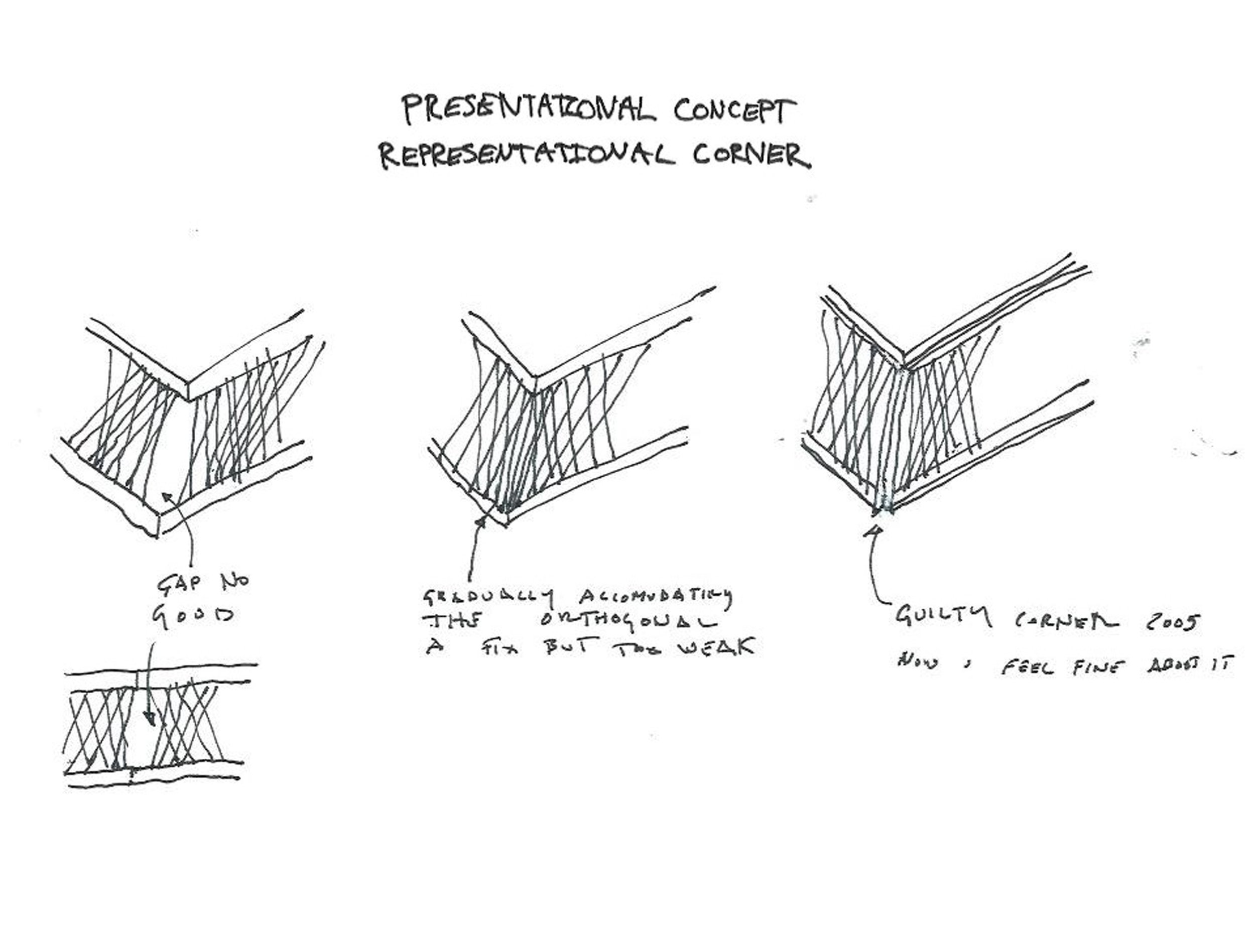
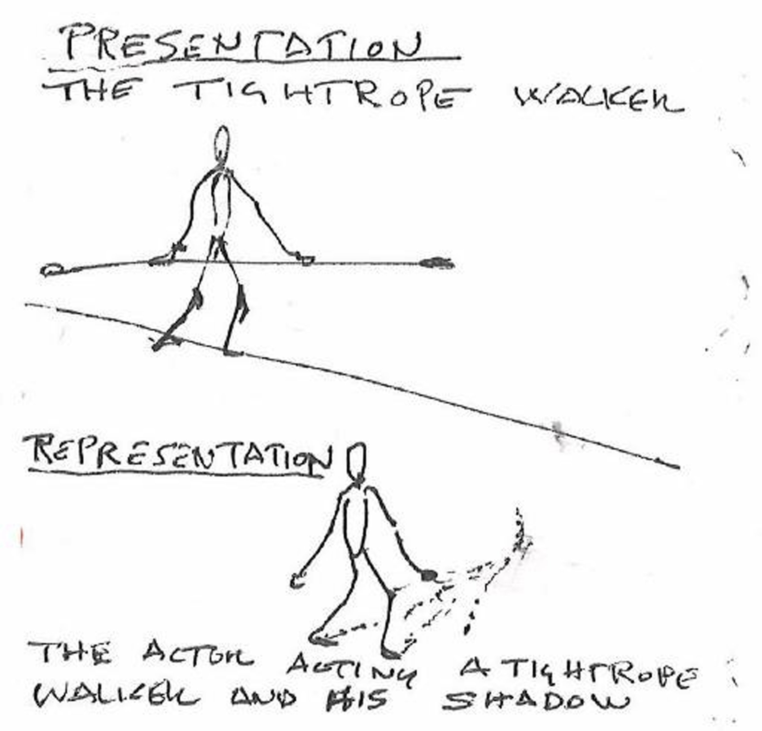
But there were also interesting impasses in Sagaponac where design sensibility came into conflict with design principles. I talk to my thesis students a lot about these situations (particularly difficult because the one thing Princeton thesis students universally abhor is contradiction compromising their concepts). Working in a very pure way with the rod-net, there were moments, like turning the corner with the rod mesh, which intuitively felt inadequate. I deliberately inserted a Miesian corner column in a non-functional way to complete the corner with greater visual emphasis. I felt guilty about that for years, until I began to reflect that probably what I was doing was more in the line of the logic of Venturi, who embraces contradiction. It was a shock to realize that we were doing postmodernism in logic if not in form. The arguments of Venturi are really compelling for me when I separate them from his pop historicist form making. Again, this is not something I would start with in a design—it would be impossible—but it was made evident in retrospect after the design was complete. So, in a way, we are working with two logics in our buildings: there's the presentational side, which would be the immediate and direct presence of the building and its immanent physics, and there's also the representational side, and it's about working again between those two logics. The presentational in medicine connects to symptoms. Its presentments are universally received and felt by anybody anywhere–like a smile, a boil, or a black eye, it’s a mute yet elemental sign. How those signs are interpreted however may vary widely by culture, knowledge, history, etc. Interpretation of the presentational is representational. The divide and juncture between presentation and representation in architecture is something we have been wrestling with for years. It’s a puzzle. In life, for example, there is no contradiction between well applied cosmetics and the human substrate that wears it. One simply augments the other.
So, as an exercise for my students, it thought it would be interesting to compare the motives of the Sagaponac House to Le Corbusier's five points. It was a very revealing comparison. Whereas Corbu relentlessly separates and articulates structure and all of the elements of his architecture, ours is always poised in-between his definition of the new and his definition of the old. The Sagaponac House is both up on piloti and traditional ground-based construction as well, so it's both up in the air and grounded. The structure is inseparable from the decorative there is no distinct articulated Corbusian strip window, but the horizontal window itself is structurally atmospheric thus absorbing the discrete columns of Corb’s model, and so on. In a really uncanny way and at all levels, Sagaponac connects to Venturi’s ethos of “both and.”
Ultimately, the score is still out whether moves like our guilty corner column actually contradicts the “pure” rod net concept, or if our pure concept itself was just a concept inadequately developed. After all, a composer would have no problem ending a glissando emphatically with any number of techniques, either inherent to the system if they’re classicists, or even external to it if they are moderns. Architects, among other artists, have been dogged by a conceptual linearity that exited the other arts in the 19th century. Contributing to this is the demand to justify our work in a simple way to clients and interested others that the other arts don’t have to deal with to such a degree; necessarily simple rhetoric in a political arena like architectural presentation is one thing; design is another thing entirely.
There’ve been a lot of discussions about the changed status of the image, especially these days. Suffice it to say we also have begun to develop a way of thinking about the image differently, first when architecture is explored within its own peculiar disciplinary logics or when, as in many nominally politically oriented architectural projects, it becomes yet another vehicle for communicating subject matter. In that mode architecture is more or less interchangeable with other media. Consequently, architecture itself is typically not the focus but rather a vehicle for representation of whatever political commitment is being advanced; typically, it is treated as a readymade or a finished category as, for example, a painter may view it. I think this is especially visible in the United States, given the upsurge of all kinds of social issues. How to locate architecture? Is it purely a material practice? Does it possess some form of autonomy? Is it entirely subsumed by politics? Particularly the politics of representation. Even as the terms of image culture shift in a wider disciplinary and non-disciplinary conversation, we have tried to navigate these issues and have used the occasion of design to consider their respective relationships. I caution that I’m not against political content per-se, but it often comes at the expense of architecture advancing its own possibilities and even its capacity for improving the world. There is for example a misplaced notion that a formally driven architecture is either apolitical or downright reactionary. Hence the recourse to the everyday, the banal, and the normative in most politically driven projects. After all Picasso did not resort to realism when he painted his arguably most powerful political work ‘Guernica’. In fact, the architecture of ‘Guernica’ was developed over many years across many works quite independent of subject matter. It could even be argued that the paintings’ continued political potency is the direct consequence of figural abstraction as opposed to the fixing of time and place that realism delivers. Ultimately the impoverished realist positions attendant on normative,“everyday” practices is founded on negativity. It would take a theologian to properly diagnose this attitude and its origins, but suffice it to say that from a psychological perspective trafficking in poverty and abjection helps no one but the architect who by identifying with suffering, in some magical way, proves the seriousness of their commitments and absolves them somehow from making things better. What is forgotten in this recourse to poverty and the banal is the singular capacity of architecture to enhance life, not just representing ad nauseam social contradictions or purveying more grayness.
Even for those for whom the discipline is a central focus the image has taken on a new and provocative resonance. Architects have begun to explore AI through style transfer programs and the like. Remarkably complex and integrated images of possible architectures have been created by grafting unlike images (architectural and otherwise) together. However, one can already see a looming impasse when such procedures are used exclusively. It goes back to the distinction between the representational and the presentational I discussed earlier. The historian Reyner Banham described such an impasse (as well as a subsequent breakthrough) in the graphical space of De Stijl in “Theory and Design in the First Machine Age”. In Banham’s account Rietvelt’s ‘Red and Blue Chair’ represents both the pinnacle of De Stijl design in its graphical universe but also its limit. Even Rietvelt’s skills as a cabinet maker could not advance the project –which appeared to have hit a stone wall. The breakthrough came when Mart Stam brought the De Stijl ‘floating planes’ agenda to the Vkhutemas in Moscow. The radical materialist orientation of that school provoked a fundamental shift in orientation from image (representation) to material behavior (presentation). The result is the springy cantilever chair by Mart Stam and all the famous cantilever chairs that followed. The lesson for us is that there is a beneficial way of trafficking between appearance and behavior in the design process; an impasse in one realm may often be overcome by shifting to the other.
So, I’ll just present a series of projects that we have been involved in.
O-14
Our first major built project (we had a lot of small ones up to that point, and of course competition work) came indirectly from a competition. It was a 22-story tower in Dubai named “O-14”, because the site is designated “O-14”. It was very exciting working remotely with a distributed team of collaborators: the developer is a Dubai native, the general contractor was Palestinian, form work and glazing from China, Lebanese architects of record, and a Cuban-American structural engineer Ysrael Seinuk. I mention his name because, at the time (thankfully not now) Ysrael was unmentionable in Dubai so he was known as YAS. It was really a very interesting and rewarding process working through problems that we had been internally speculating on but now could be made real. But how to make them real and how to deal with them in a really pragmatic way, given the constraints of budget, time, and so forth? What brought us this project? One of the major players, the developer Shahab Lutfi, invited us to a competition for the central tower in an area of Dubai called “Business Bay”. We lost the competition to Zaha Hadid, but then when Shahab began his own practice as a developer (he was working with “Dubai Properties” when he ran the competition) he selected us to work with him.
The tower is formally quite simple: a soft cruciform plan and a concrete exoskeleton which changes thickness 60 to 40 centimeters from base to top. All of the gravity and lateral forces are taken by the drum of the exoskeleton; therefore, the core could be relatively light. It was similar to the shell of a nuclear reactor containment vessel, a very thin yet rigid structure. Then there was the development of underground parking, and the urban design that we developed in the design process. One of the things that's quite typical in Dubai is that they will build an outdoor parking structure at grade in the lot behind a tower. This was encouraged at first but we were able to argue successfully that the parking structure should be put into the basement, because the site is very prominent and it would also allow us to create a public space under this floating podium that would allow people to connect from a back street to a waterfront esplanade. Shahab was very interested. It was very valuable space but potentially very nice space, so he could justify the extra investment. We were constantly working with and against a master plan that governed the whole development. The post-modern inspired guidelines mandated towers have a base, a middle, and a top. Our task, from our perspective, was to argue for a building that didn’t look po-mo but achieved the desired urban effects. We argued successfully for a podium “base” that floated two storeys above ground; they wanted arcades at the base of the building, and we argued that the shell of O-14, if we reduced the size of the lobby, would act as an arcade. All of this was in the service of really trying to make public connections under and through the building.
We also were inspired by some of the suggestions that OMA made. For a short time, OMA had control of the Business Bay masterplan. Ultimately it was wrested away from them by a British conglomerate that had old roots in Dubai, but we thought OMA’s idea of creating a second level of continuous green space was excellent. That was incorporated into our plan (although I’m not sure if the private owners ever really connected the buildings that way). Anyway, within the floating podium the slabs are connected by bridges to the open office plan within the tower, so it's really an expansion of the offices and it's all lifted up to allow movement under and through. People use this outdoor space for exercise every night. There's a continuous breeze generated by the vertical gap between the tower and the exoskeleton. A club discovered this and they opportunistically scheduled classes there that are mainly comprised of expats trying to keep in shape.
Buildable geometry was a large part of the project. The design process was not linear, and in the first iterations of the building we thought we would put glazing in the holes. It was not good for a number of reasons; it would mean that you would have an enormous number of custom bent pieces of glass depending upon where the windows fell on the geometry of the tower volume. I thought the aesthetic of the pure exoskeleton was much stronger without glass, moreover the window frames were ugly and would then further close down the openings of the holes. So, we moved from that to a solution where a simple window wall divided the inside from the outside; the exoskeleton would then become really exo. It would lose all of those problematic windows, but because the window wall had to be cleaned, we needed three feet of space between the exoskeleton and tower. This in-between space created an environmental benefit, inducing a strong stack effect. Our MEP engineers told us it would reduce the cooling costs by about 30 percent. In short, the stack effect feature actually came about indirectly as a result aesthetic and financial considerations. Evolutionary biologists would term that phenomenon an exaptation.
As an aside, there's great interest quite rightfully about creating sustainable buildings, and by extension sustainable architecture. I would say that we have to be very careful about what we mean by sustainable. To be strict about it, almost any architecture can be made sustainable. There is no one “sustainable style,” and I think that’s actually a good thing. A sustainable world is inseparable from a scalar question. I mean, sustainability only becomes significant when you have statistically significant quantities of buildings that perform sustainably. In that respect, those quantitative values fall outside of the specificity of the architecture; that's really more a performance value than it is an architectural value. Granted performance values are important, but you see almost ad nauseam buildings that, you could argue, are more about advertising their sustainable features. Whether or not you need to signal sustainability to make a sustainable building is an entirely different question. By extension, and I don’t mean to sound perverse, from an architectural perspective the propaganda around the sustainable look overdetermines architectural expression at the expense of a wide range of architectures that would perform equally well. It’s ultimately a politics, a matter of free architectural expression.
So, to get back to O-14, we worked on many kinds of exercises dealing with the specific geometry of all of the form work, determined by how they lay on the shell, and whether they would be reusable or not. Ultimately, it was decided that these would all be waste molds, that it would be too costly to reuse the void forms, and much faster simply to fabricate new ones on site. The first storeys took approximately three weeks to complete and, by the end of the project, about one week to do a storey. There were a lot of construction challenges to work through. It spoke to the willingness of the entire team to take risks, to try something new, and the enthusiasm of working together on something that wasn't so standard. Some of the openings are big, multi-story portals; others gradient down to scale of a person’s head.
Geoscope 2
I’m going to go to a completely different scale of project now. This was a project that we were involved in with the historian Daniel López, who is a professor at the University of San Diego. We designed a show for him at Princeton based upon his book on Buckminster Fuller, “Pattern Thinking”. Fuller built a whole series of constructions at various schools of architecture called “geoscopes,” one of which was actually built at the School of Architecture at Princeton in the early ‘60s. These were to be the first baby steps at representing, in real time, dynamic information of all kinds happening at the global scale, but also, (because of Fuller's ideology and interests), the parallelisms and analogies of his geodesic concepts down to the micro scale. Of course, at the time there weren’t computers or media that could accomplish these feats: the Princeton geoscope was a large transparent vinyl geodesic sphere with colored decals representing the continents, clearly just a static placeholder in anticipation of technological advances to come. We were approached at the very last minute to design and fabricate the show. I only had a weekend to absorb a mere fraction of Daniel Lopez's book and further there was an enormous amount of photocopied material that Daniel wanted to present.
So, ignorant of most of the book’s contents, particularly of the geoscopes, we basically reinvented one. It would be spherical because we knew enough to know Fuller liked spheres and because of Daniel’s interest in showing so many documents from the archive, far more than the gallery walls could hold. The logical move was to convert paper to digital projections that could change during a visit to the show. It developed into a hollow sphere comprised of inflated pillows where you could use rear projection. I was also recalling biological references from embryology: the blastula, a hollow ball of cells that occur at a certain stage of development. We created graphics too. Then we came up with the idea of elevating the sphere on legs like a moon lander. The idea was that the students could crawl inside, three or four of them at once, and recline on a glowing contour couch, and then watch the exhibition projected on the pillows inside. We didn't want to repeat a Fulleresque geodesic, so we started with his interest in the primary solids and then began to superimpose the dodecahedron with the icosahedron. We then reduced those to a field of points, and then produced a Voronoi pattern, which we mirrored. The Voronoi pattern, rather like a complex soccer ball, would also be less regular than a Fuller geodesic, closer to the way reticulations work in natural forms, like a tortoise shell. That would be the geometry of the pillow field that we would project against. We were also inspired by those amazing photographs of the first atomic bomb; the sphere was sprouting wires and sensors and all of the other things necessary, and we were going to get a similar effect mounting 46 miniature digital projectors on the outside of the sphere with all the necessary electronic paraphernalia. The top of Geoscope 2 is inflatable, and the bottom is actually a padded wire cradle that could carry the heavy weight of people inside. We rapidly explored various translucent materials as well to illuminate the interior from above and below. Pressure tight portholes were made with photo filters and, ultimately, we were able to project very high-resolution images through the pillows to the interior. There was sound and light, and a film on Fuller. It was really quite effective. We designed it in under a week and fabricated it in less than three. Of course, we had expert help from the Swiss media company iart, a marvelous architect/inflatables expert Pablo Kobayashi, and the expertise at the Princeton SoA shop along with our students. Still, it was very closely run thing.
We were invited to the “Venice Biennale” (which should open in a little less than a month), and because of COVID rules the geoscope had to be split in half, so people could walk through it instead of climbing inside. That's what we're working on now and, instead of projecting a Fuller show, we and Daniel asked a wide range of architects and thinkers—contemporary voices from Kazuyo Sejima to Timothy Morton—to speak on what is important to them now (it will be both a group speaking all at once but then also speaking as distinct individuals) babble-like at first but ultimately articulate. It's really an interdisciplinary collaboration on the present.
Taipei Music Center
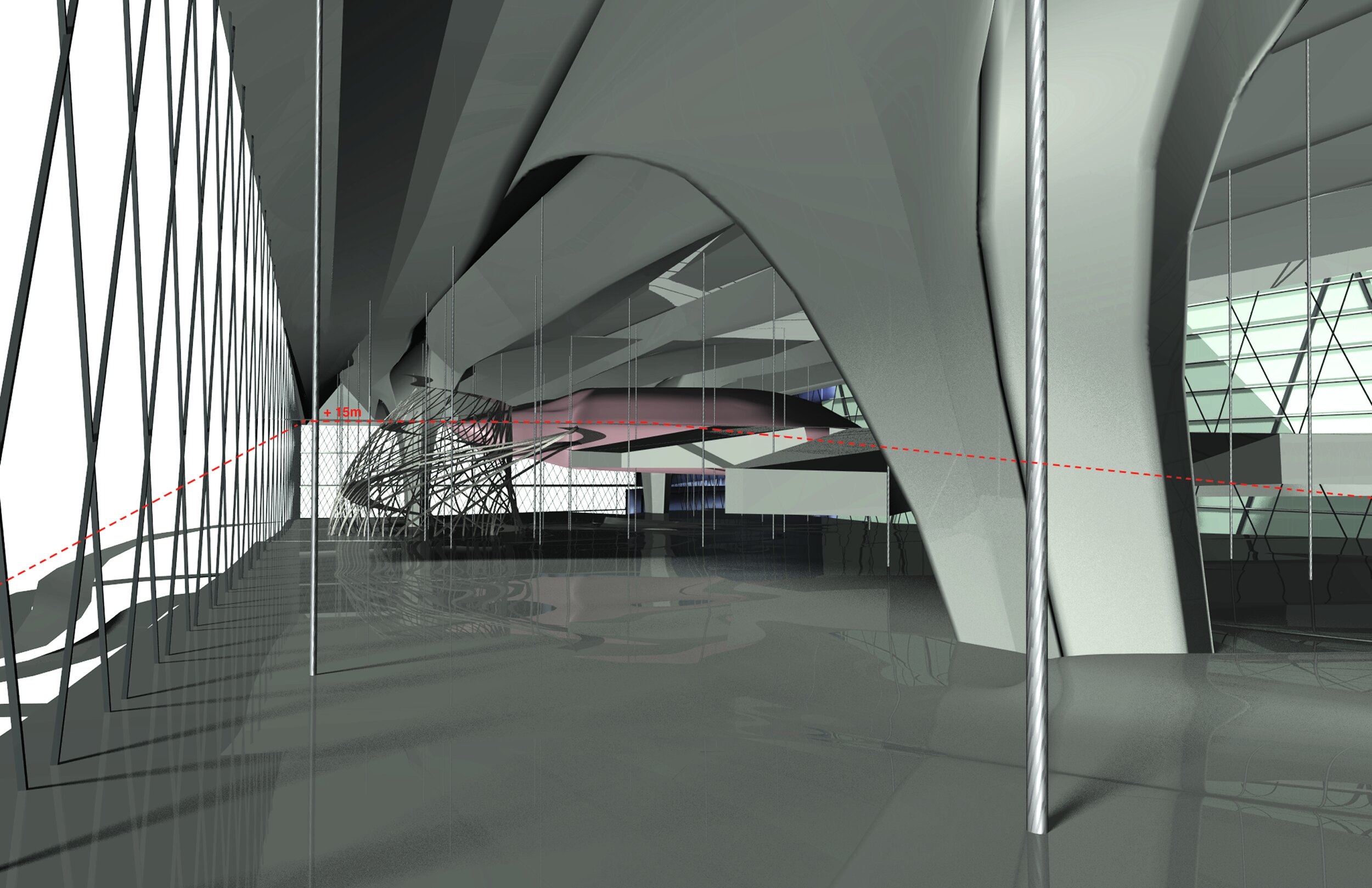
Moving on to the largest project we’ve undertaken, the “Taipei Music Center”, which is almost complete, (the main hall is finished) was a competition we won about 10 years ago. The demand, above all, was to create a new area of Taipei dedicated to popular music, particularly its production and reception. We were really drawn to the natural context, not the existing buildings (it was an old factory zone, everything was slated to be torn down). There is a remarkable relationship to nature characteristic of the edge of Taipei, being so close to the foothills and mountains that ring the city. We sought to relate to that aspect of the physical context. Unlike most western cities, there isn’t a deep peripheral zone or suburbs around Taipei. Rather there is a radical juxtaposition of the urban to the natural. Colonial industrialization by the Japanese before World War 2 followed by rapid development by the Nationalists after the war resulted in the rapid changeover of agricultural valleys to raw industrial and infrastructural tracts fingering outward between verdant hills. The existing building site was a brown scar enfolded in a green paradise. It's in an area of Taipei that's undergoing a lot of restoration and development now, called Nangang. The Music Center site is actually two sites: a very long narrow site which will have a large circus-like outdoor performance space flanked on one end by “The Cube”, which is a museum and archive, and on the other end by the “Industry Shell”, which is a production facility. Across the road is the polygonal site of the Main Performance Hall. The sectional idea was to think of this project as having two horizons. One is the ground and the other is an elevated, artificial ground upon which three object buildings sit. The two sites are tied together by a bridge. There's a planning mandate in Taipei for elevated circulation across all major roads, so it suggested thinking of the city as occupying two different datums. As I mentioned, there's a very large open outdoor plaza surrounded by retail, restaurants, and cafes; as well as four live houses which will surround the outdoor performance space and, a 5000 seat Main Hall across the road. Overall, the project demanded a high degree of volumetric definition. We work through a lot of physical models, it's not something we have abandoned at all; both handmade and digital modelling are really mixed in the studio. The main hall, in terms of scale, is very similar to Bernard Tschumi's “Limoges Concert Hall” (both 5000 thousand seat halls).
Performance halls are program heavy and volumetrically large, especially when you confront all of the back of house functions. We were not into designing a massive vertical building coming out of the ground, as in Tschumi’s project, but saw an opportunity to deliberately split the building sectionally between a ground building and an object building. This radically reduced the apparent mass of the building. The ground building flanked by earth berms, which contain all of the service functions (especially the back of house), all of the loading docks for sets, and other kinds of equipment that would feed into the back of the hall. The object building, which encloses the auditorium, perches on top. At grade, there is a major entrance for red carpet events; the general public uses that level if approaching on ground and the elevated level if they cross the bridge from across the street.
The silhouette of the three object buildings in the complex was really crucial: as icons, for orientation, and as aspirational destinations. Not that we were trying deliberately to mimic Japanese or classical Chinese buildings, but I am fascinated by the atmospheric presence of looming eaves against the sky, curiously style-less in direct experience and only presenting a gestural motive when flattened in drawings and photographs. The Main Hall is not a simple object but is conceived of as nested volumes: an outer “exterior shell” and an “interior crystal” (which encloses the performance hall). The idea is that the bridge that joins the two sites would be co-extensive with the circulation inside the Main Hall. So, as you walk across the bridge, you pass through the outer envelope into the vertical lobby and seamlessly connect to all of the mezzanines that wrap the performance hall volume within. The Music Center is so large that it creates its own context, but it does so in relationship to its unique position between city and terrain.
When considering the cladding of the Main Hall, we became fascinated with special metal treatments that are available in Asia. Specifically, there's a type of anodizing called “alumite”, that was and is used in Japan for everyday objects like bento boxes and tea kettles. It was first developed for military aircraft because it was claimed that its pale gold color, reflecting light differently from silver aluminum, could work as camouflage, ever changing depending upon the state of the weather. So, I thought that could be a really interesting way of thinking through the color of cladding for the building. Indeed, the effect works. The color of the Main Hall varies tremendously depending upon the lighting conditions. Also, since I am aircraft obsessed and because corrugated metal is ubiquitous in Taipei—mainly associated with cheap building—I was interested in using directional cladding but pushing it to its limits. Looking at precedents in aircraft construction from early to mid-20th century, techniques were perfected to shape corrugated aluminum beyond aircraft skins down to elements like partitions and seats, particularly in the Junkers airliners in the 1930s (fashioned in many cases by graduates of the Bauhaus which was located across the street from the Junkers factory). Corrugated metal was pushed to its limits, the material itself being challenged to accommodate the complex geometries of aircraft. As a result, all kinds of beautiful yet functional details were developed. We ultimately shifted from corrugated to standing seam cladding. Nevertheless, the directionality of the standing seam was analogous to corrugated material, so the Junkers lessons could be applied very directly to the Main Hall skin.
The urban scale of the Music Center allowed me to revisit some of the arguments of my teachers, specifically Aldo Rossi, with whom I worked in the late 70s and in the mid-80s. One of the things that I remember him relating was the persistence of form in the city. As an example, the “Circus Agonalis” took 1500 years to become the “Piazza Navona”, but the circus’ persistent trace determined the form of the piazza. We did an accelerated version of that logic for the “Taipei Music Center”, where over the course of twenty-four hours the project would shift from being a circus at night for performances to a piazza by day with restaurants, cafes and so forth surrounding the oblong space. So it was, in the spirit of Rossi, touching on very new things and also very old things.
Kaohsiung Port Terminal
Now I’ll speak a little bit about a project which will probably be completed by the end of next year: the “Kaohsiung Port Terminal”. It was, like many competitions in Taiwan, a planning project as well as specific architectural project. The port of Kaohsiung is the most important and active container port in Taiwan. Its Port Authority wanted a new tower, as well as a major cruise ship terminal. In a way, it is a sister building to the “Yokohama Port Terminal”: the cruise ships that berth at Yokohama will also visit this building.
We were interested both in the specific object of the architecture—let us say—but also in its location on the edge of the harbor, and the importance urbanistically of keeping this edge site continuous. The competition demand was to bring the general public to this site and to use the edge, but the problem is that it's still a very active port; it's not a post-industrial site. So, we argued again for two primary datums, one that would channel the general public on an upper level and one at grade to handle the functions of the port and all of the industrial uses. One of the main spatial arguments we made was that everything should be clearly visible when you enter the terminal: the different cruise ship docks as well as the elevated public esplanade that would ideally continue past the building along the entire harbor edge.
Different scales and types of ships will be used by this terminal, from domestic ferries to large international cruise ships. It represents a major investment for the city and is integral to the master plan for this waterfront site. In aerial views you can see other buildings (including a pop music center), which are now being built along this working waterfront. Of course, we have no control over any construction outside of our site, but the extended idea of our plan is that that elevated esplanade would continue along the edge and make pedestrian links to these public programs.
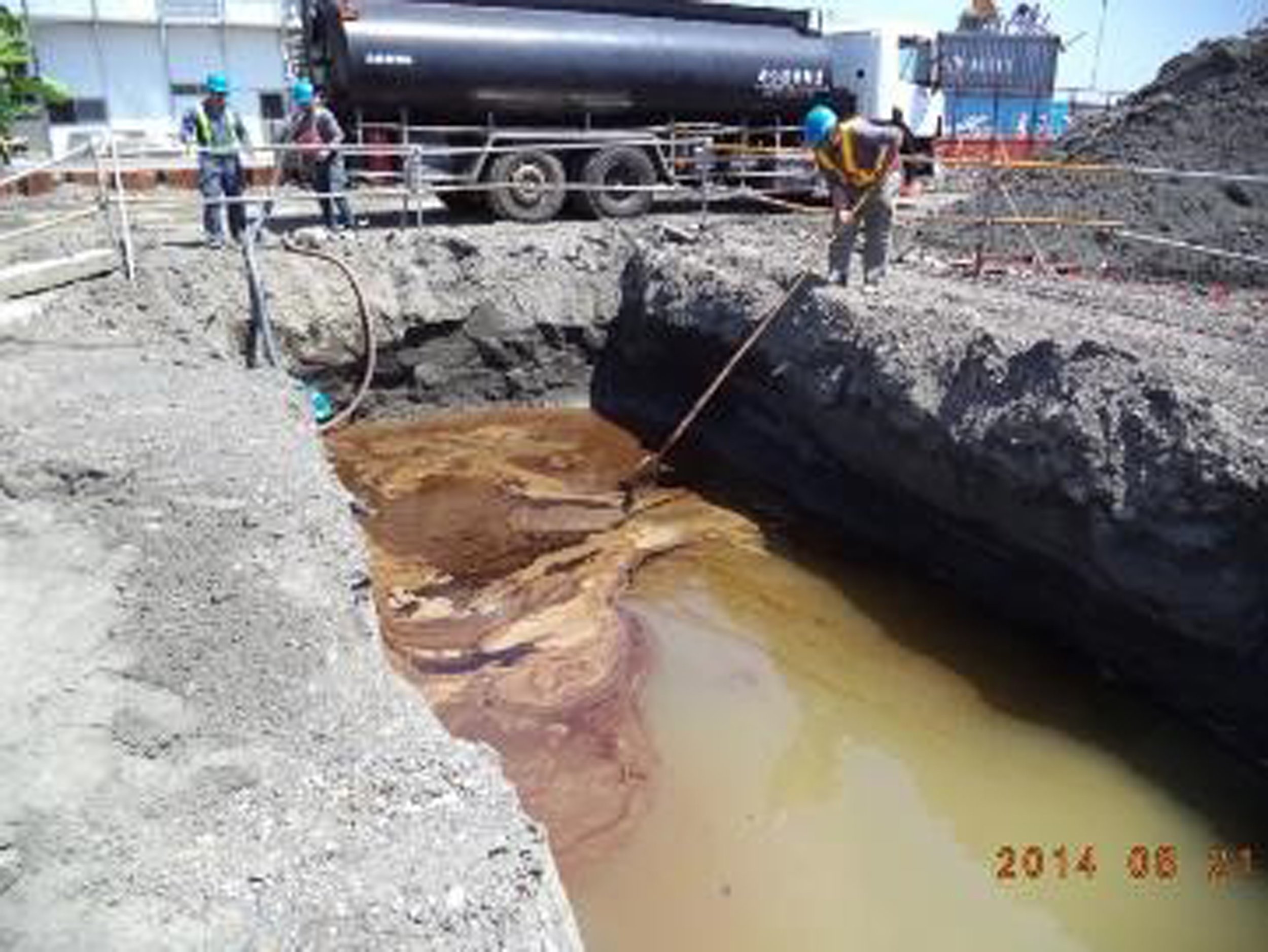
Once construction began, a major problem was encountered, and we discovered it was part of the deep material history of the site. During excavation for the foundations, a layer saturated with oil was encountered inches below the topsoil. It turned out that historically this site was an oil storage facility. The first one was built for the Imperial Japanese Navy by Mitsubishi when they occupied Taiwan from the turn of the last century to the end of the Second World War. There was an oil storage tank farm on the site, which leached petroleum into the ground. We found photographs of the original Mitsubishi tanks built during the 20s and 30s for the navy. I was even able to find the reconnaissance photographs in preparation for the bombing of the site by the US Navy. Images were made before, during, and after the bombings (it’s all available in the US National Archives). No doubt most of the spillage happened during those events. China Petroleum put new tanks up after the war; those also leached into the ground. So, all that historical soup had to be removed and the soil remediated before construction could proceed. It took three years.
The terminal is a sandwich in section. We made very clear distinctions between the service functions at grade, the terminal level that was in the middle of the sandwich, and then the public boardwalk above. That tripartite section runs through the project.
We had been exploring the spatial model of the tri-lobe for years, it began with theatrical design, but we saw we could actually use it in reverse by turning the arrows of vision the other direction from a theater (where they would converge at the stage). If one were looking outwards from the stage, you could easily, like in optics, reverse the arrows and views, and people could see and move the other direction. So, what started as a theatrical plan actually gave us the spatial and circulation logic for the port terminal. We also took advantage of thick walls, of poché, putting all of the vertical circulation into the in-between of the walls to keep the public spaces relatively clear and clean.
We argued for directed space in the terminal (as opposed to a gridded columnar space), and at every level you enter the space you can see what's going on but not always physically connect. That is a crucial security element of the project because of the clean zones that necessarily separate ticketed passengers from the general public. So, one could go, like in an airport section, directly from the drop off to the ship, and if you had more time, you could go up to a restaurant which would also be accessible to those who are on the boardwalk, and if you are disembarking you go down and out, as in an airport.
I’ll close with a paraphrase of Sir Peter Cook. He rhetorically asks: “What’s the point of doing design if you don’t discover something you didn’t know before?” Right! I always tell my students that if you don’t get your design started, your working assumptions will come to naught. It’s not a matter of perfecting your concept before beginning, because if you’re smart and receptive to your work you’ll recognize that the design is always different from what you thought it was anyway. So, stop thinking and start designing, remembering that drawing and model making IS architectural thought par excellence. And as for design theory, en famille, it naturally follows that its best elaborated retrospectively; criticality and analytic rigor are important but they come afterwards, not before. We write our books that way. I love Borges’s formulation that “every writer (architect) creates their own precursors” and thus rewrites history with every new work. My final exhortation, the writer’s adage, puts it succinctly: “Compose in fury, correct in phlegm.”
Any questions?